

We are Wallbox
Wallbox represents a commitment to innovation and excellence. We strive to create a brand that is visible, tangible, and perceptible, inspiring those who are drivers of change.
Our brand is a reflection of who we are as a company, representing our values and our commitment to innovation and excellence.
With our iconic brand colors, clear layout structure, a variable corporate typeface, and other precisely developed elements, we're forging a new path in terms of design.
Our Identity
Our identity is a design opera composed of several core elements that come together to create a distinctive look and feel, making the Wallbox brand easily recognizable. The following guide will walk you through these core elements and assist you in designing and producing compelling communications with a high degree of creative flexibility.

Our brand
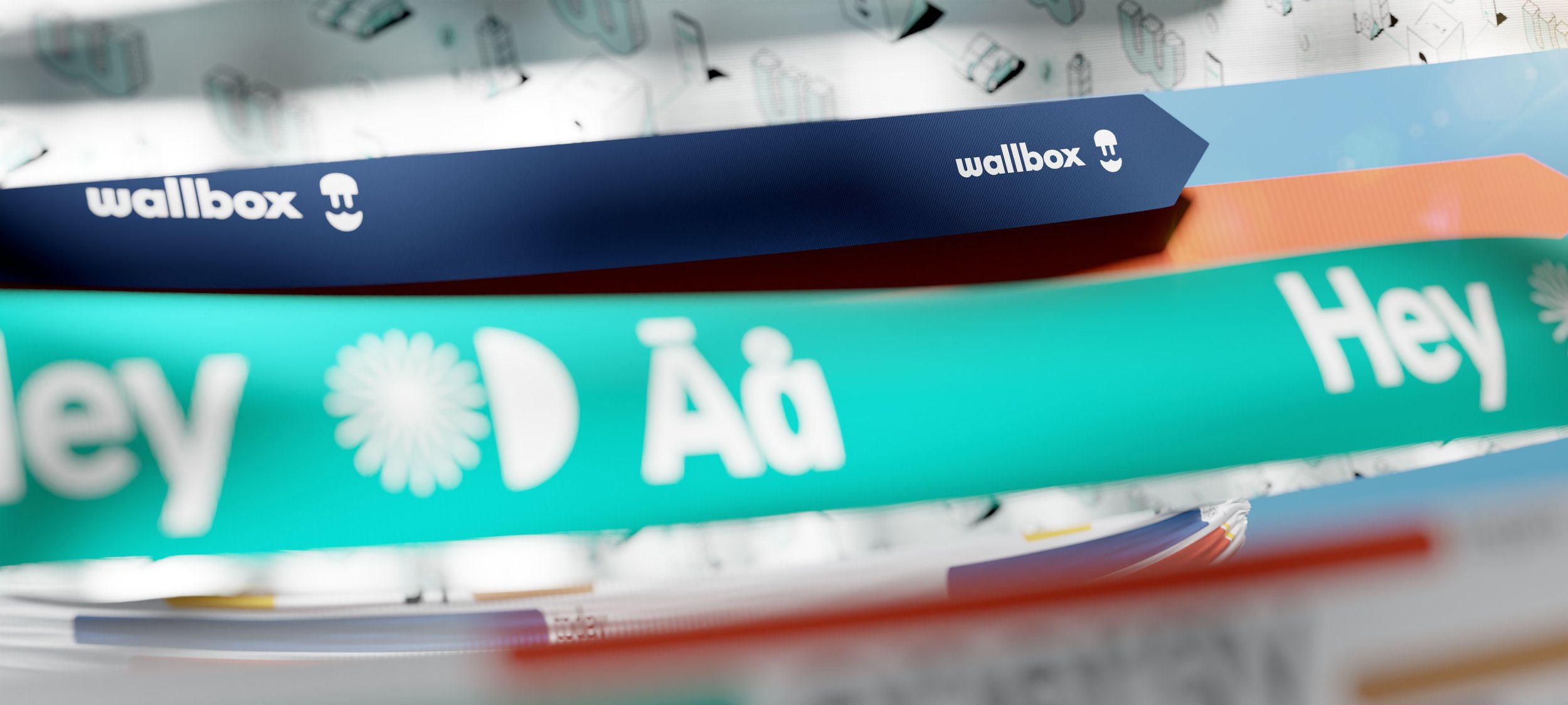
The brand is the most visible element of our identity – A universal signature across all Wallbox communications. It’s a guarantee of quality that unites our diverse communication.

-
ZIP | Wallbox Brand
Format: AI, JPEG, PDF, PNG & SVG -
To protect the clarity and visual integrity of the brand, it has an exclusion zone. It must always appear legibly on a clear background. The Brand files includes the protection area already; please respect.
-
Our brand must be applied in black color over light backgrounds or in white over dark backgrounds. Any other color for our brand are forbidden.
-
According to different country legal legislations and specific applications, our brand can include the registered mark, either ™ or ®, at the end of the composition.
Because the brand is such a recognizable and highly visible identity asset, it is vital that it is always applied consistently wherever it appears. Please, do not distort or alter the brand file under any circumstances.
Get in charge
Our tagline is Get in charge, starting always with an upper case and written in English. Our tagline cannot be translated. If needed due to legal reasons, please get in touch with the Marketing team.
The visual appearance is created with our corporate typeface HeyWallbox using a display version in its medium weight.
Lock-up Brand
How to use & apply our tagline

Spacing & Structure
We use the width of the Wallbox “W” to separate both elements, our brand and tagline, with the aim to create the security space around. In exceptional cases when the format doesn’t allow a horizontal composition, the tagline goes under the Wallbox brand.

Color Usage
The lock-up version can be in either white or black color depending on the background. The aim is to achieve the most contrast possible to ensure a proper color accessibility. Keep in mind that the whole lock-up brand always go in the same color.

Minimum Sizes
Minimum measurements are necessary to preserve readability for both print and digital. Please keep an eye on the following guidance to ensure we make our brand stand up from any single comms touchpoint.

The isotype
Our isotype is a key strong visual stamp. Only in certain cases where our brand is duplicated, we reduce the over-branding by implementing our isotype. A clear example is when applied in spatial, industrial design or digital disciplines.
In case you need to use the isotype standing alone, please address to the Design team for permission.
Corporate Palette
Inspired by our Barcelona-Mediterranean light; Wallbox color palette expresses the different values of our brand. The use and good balance shown here help you to use good combinations to achieve the right color atmosphere in your communication.
Applying the identity is more than just placing a brand + its corporate color. Thusly, the color palette helps to provide a color alignment to express our identity and attitude visually while preserving consistency. Please download and read carefully the following PDF for you to understand how to apply our color scheme accordingly.

Typeface
Our design-awarded custom typeface is called: Hey Wallbox.
International approach covering 215 languages via 5 weights and 2 variants. The typeface design is a sans serif humanist with a neo-grotesc base and contemporary finish. The final result ensures legibility and readability in both on and offline assets.
Ink traps, sharp cuts and unconventional alternates are designed based on our industrial design DNA for an easy brand recall making it singular from a specific sans serif new genre. Furthermore, we have optimized it for hardware and software taking also into consideration complex tech environments like HMI screen in field.
Hey Wallbox is the perfect tandem between the user and our products making a real brand connection.

Iconography
Our icon set helps to indicate information and interactions in a simple, direct manner. The design style is derived from the lines of our brand. Learn how to use them, their behavior, and how they are made here.
The Icon Library, with all SVG files, is also available on our design system library.

Wide range of file formats
Wallbox icons are available as SVG for digital applications, as EPS for print applications and as PNG for digital applications and MS Office.

Meet all suitable sizes
Dedicated line stroke to meet sizes requirements for each icon, it is possible to adapt display to the function in question.
Carefully conceived file structure

All icons are placed within an invisible square area that helps with positioning.
Style and structure
Icons should be made up of as few elements as possible. To achieve a constructed style, use a fine, constant contour thickness of 2 pixels and avoid filled-in blocks. Alternate right angles with rounded corners. Icons are generally used in black and white.
Usage
Each icon is assigned to a term, fact or a system representation. We have divided them in two categories:
Content icons which represent things and facts like mobile phone, Wifi, savings, output or a charger.
System icons that represent system interactions or commands such as save, add, download.
Size & colour
All icons are placed within a basic square area that is invisible. This defines the size of each icon and helps with positioning and orientation.
The important thing is to achieve a precise and fine effect of the icons within the layout as a whole. For this reason, they are applied in their original size in screen media and are depicted crisply with pixel accuracy. In other contexts, apart from screen media, the size is based on the text size used. Small icons should be 1.5 times the size of the text in pt, while large icons should be three times the size of the text in pt.
Icons should be always in black or white. Color implementation is not accepted unless color is key and meaningful for the resulted asset. Icons should always be 100% legible and accessible.
Placement and Spacing
Icons should preferably appear to the left or right of the associated text. The minimum spacing from the text is ¼ of the basic area. If several icons are placed alongside each other, the minimum spacing must be consistent in ¼ as shown below.
States & Animation
In digital interfaces, icons can be animated or take on different shapes to signal a certain state. The transitions between these states are described as microinteractions.


