Corporate Comms
Wallbox's corporate media provides a consistent structure and visual resources for various platforms and corporate materials. The goal is for you to use layout key materials in accordance with the Wallbox brand guidelines, making the most of your daily basis. This helps build a strong and powerful brand while creating a consistent and recognizable identity that is easily identifiable by employees, customers, and partners.
Mind the gap
Useful information to take care of our brand

Minimum sizes
The minimum sizes are necessary to preserve readability. Please respect these recommendation in order to ensure the right definition of the brand.

Protection area
Clear space must be respected in order to ensure that our brand is not overlay with any other graphic element.

Registered Mark
According to different country legal legislations and specific applications, our brand can include the registered mark, either ™ or ®, at the end of the composition as shown above.
The Brand & The Grid
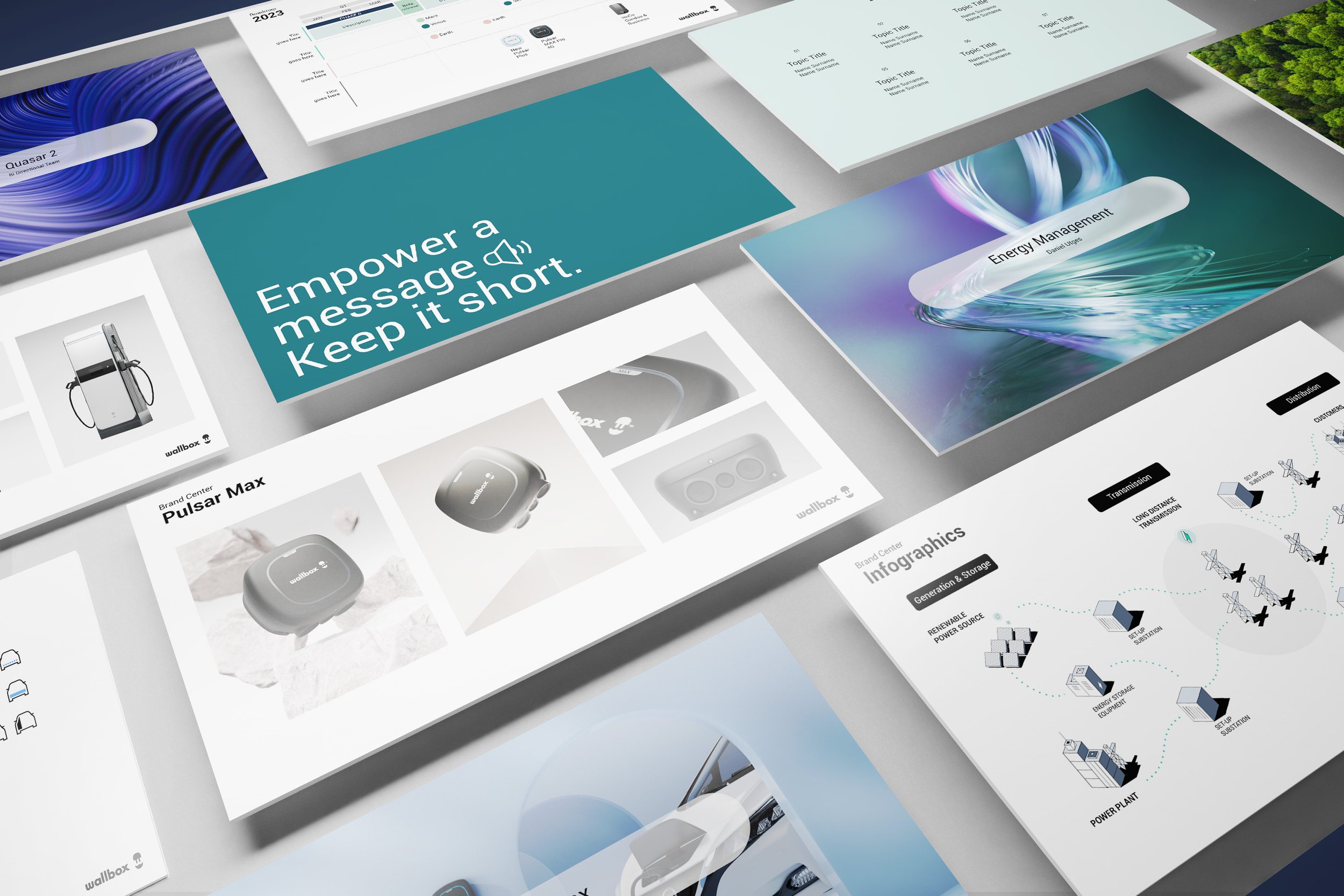
Wallbox’s layout grid is designed to provide a consistent structure and hierarchy across its various platforms and marketing materials. The grid is typically used to organize content into horizontal sections, with each section consisting of a certain number of columns. For example, a section might be divided into three columns, allowing for a header, a main content area, and a sidebar.

The Grid
The layout grid and spacing guidelines are used across all of Wallbox’s platforms and marketing materials, from its mobile app to its website and print materials. This helps to create a consistent and recognizable brand identity that is easily identifiable by customers and partners.
Building a XY grid. The following modular template consists of 26 horizontal frames by 40 vertical ones. This is based on a standard DIN format. Wallbox’s grid is based from our minimum module width: our isotype. This allows to create modular, flexible and responsive layouts that can be easily adapted to different screen sizes and devices.
The brand position
Depending on the content and purpose of the communication, we can place our brand at the beginning or end.
Our brand should only be placed at the top of each composition when it acts as a presenter for the layout communication. The alignment of the brand can be left or right, depending on the general composition.
We suggest placing the brand at the bottom (right-aligned only) like a signature for those cases where user readability and composition constraints happen or when over-branding results like product communications, allowing the content to fit naturally.
Please check how our brand is aligned, either left or right. Keep in mind that our brand cannot be centered aligned or placed freely in the composition.

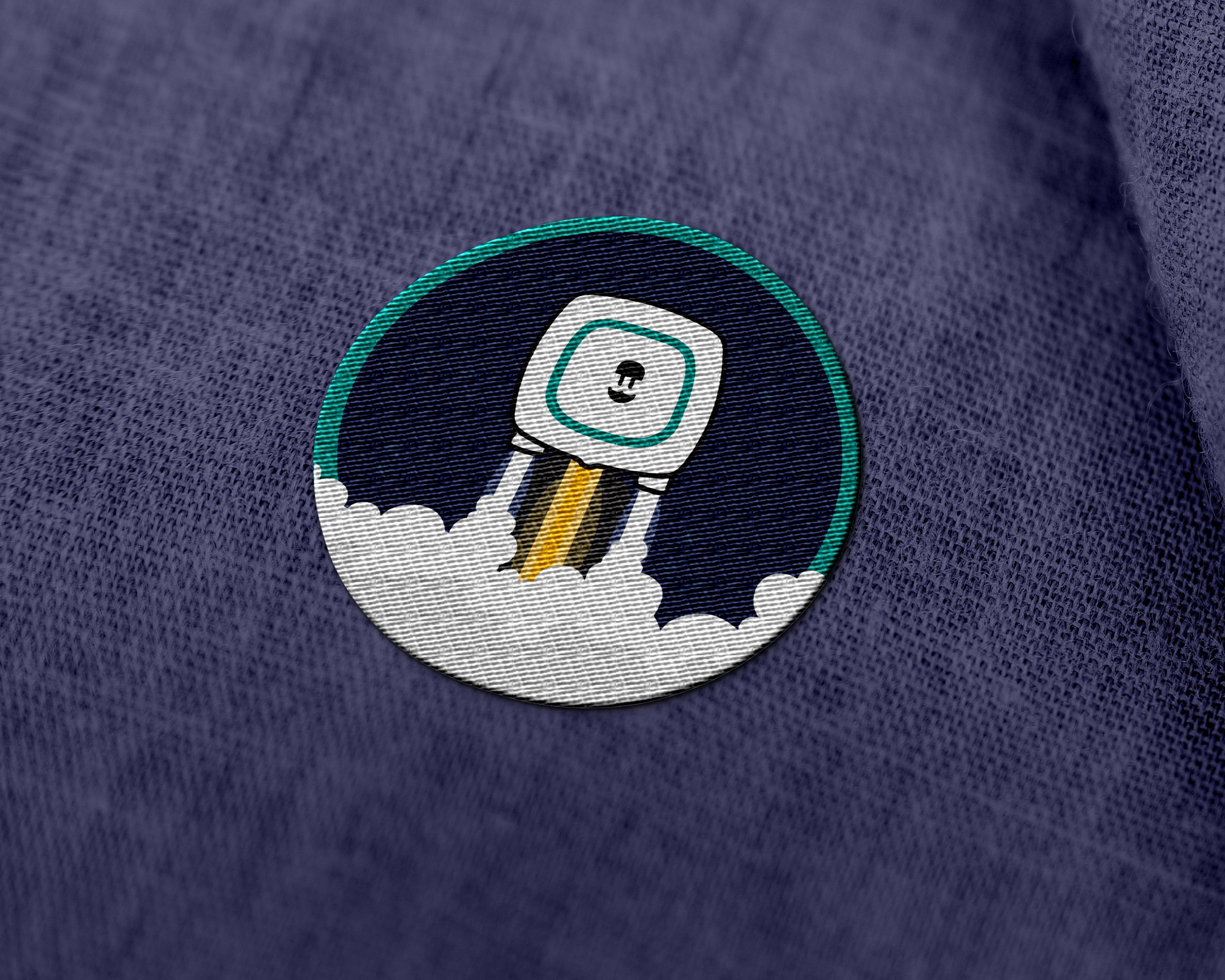
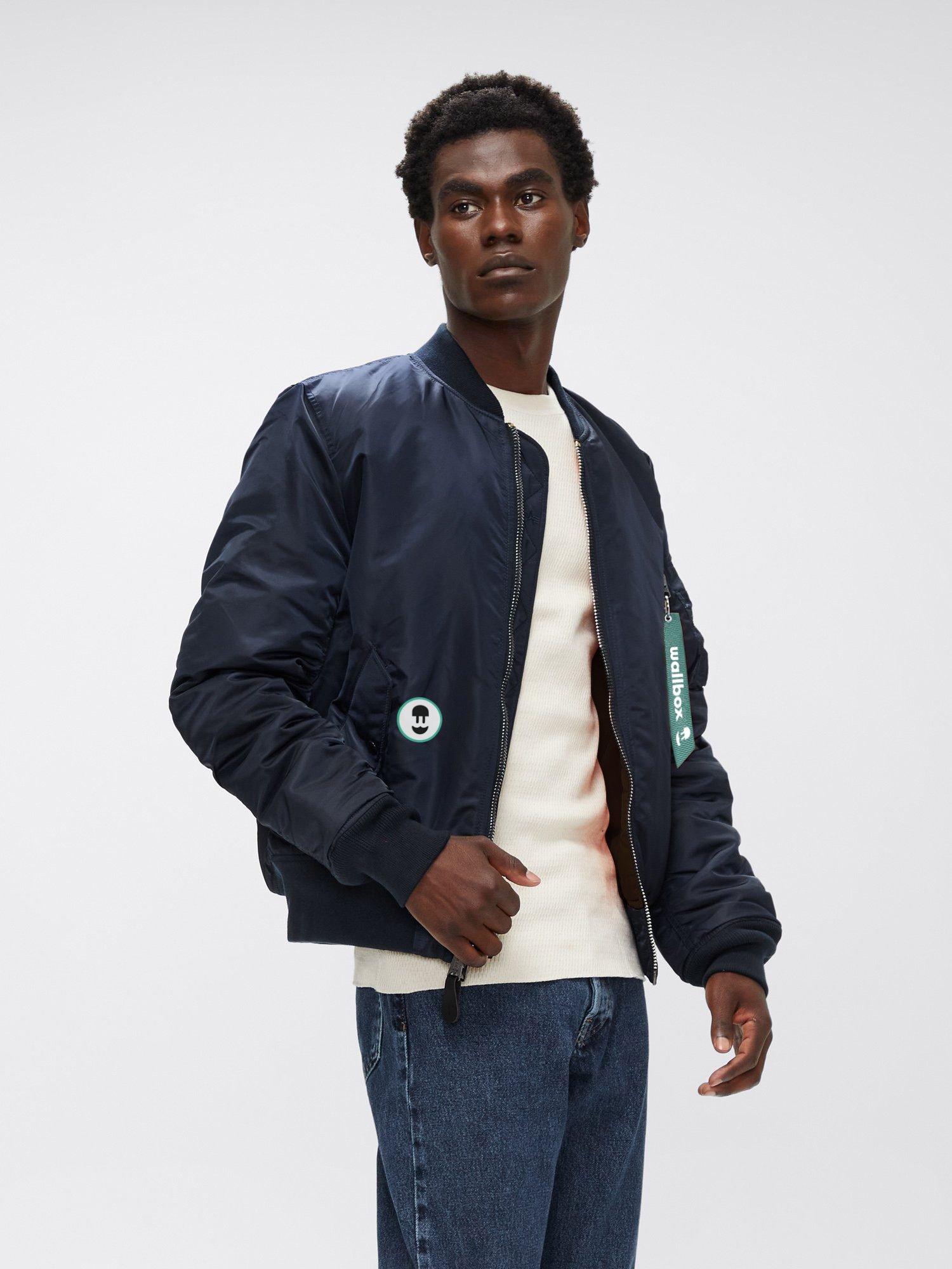
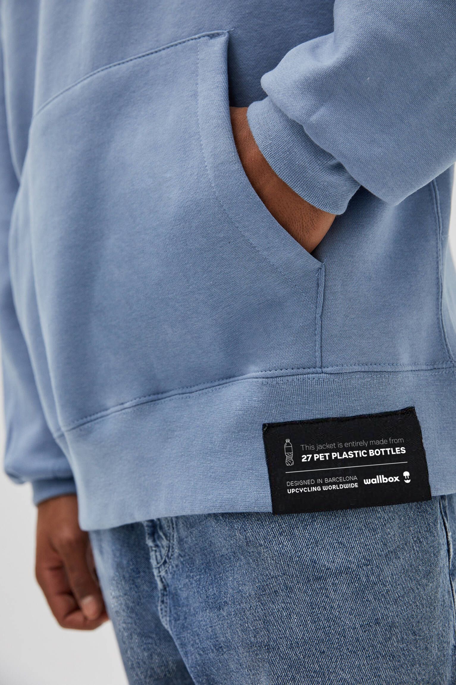
Our identity is not just a logo
A flexible design system allows to combine our brand ownables and create the perfect opera composition for each asset according to specific business goals. This ensures a higher visual richness and a consistent, recognizable identity.


-
-
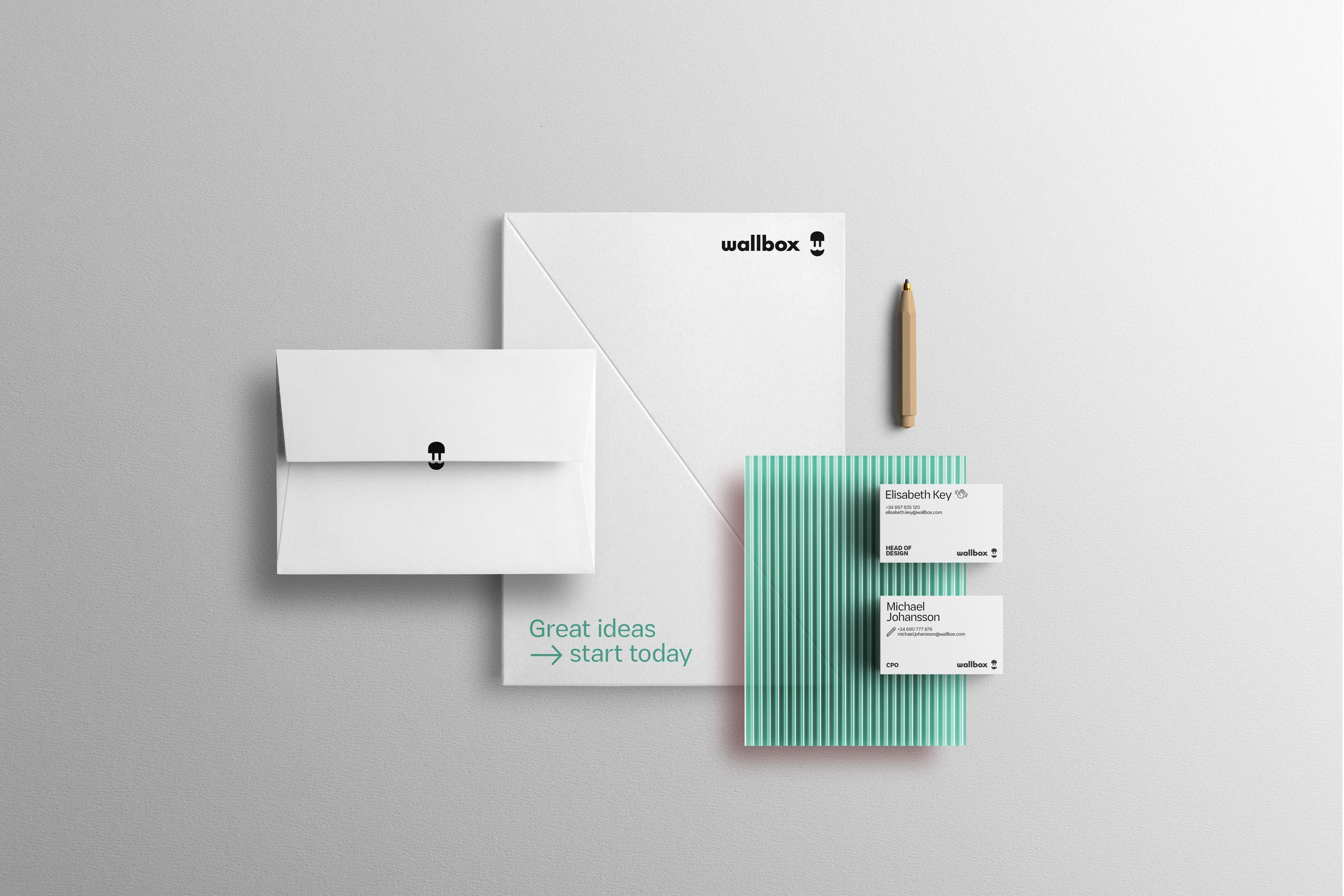
Letterhead template
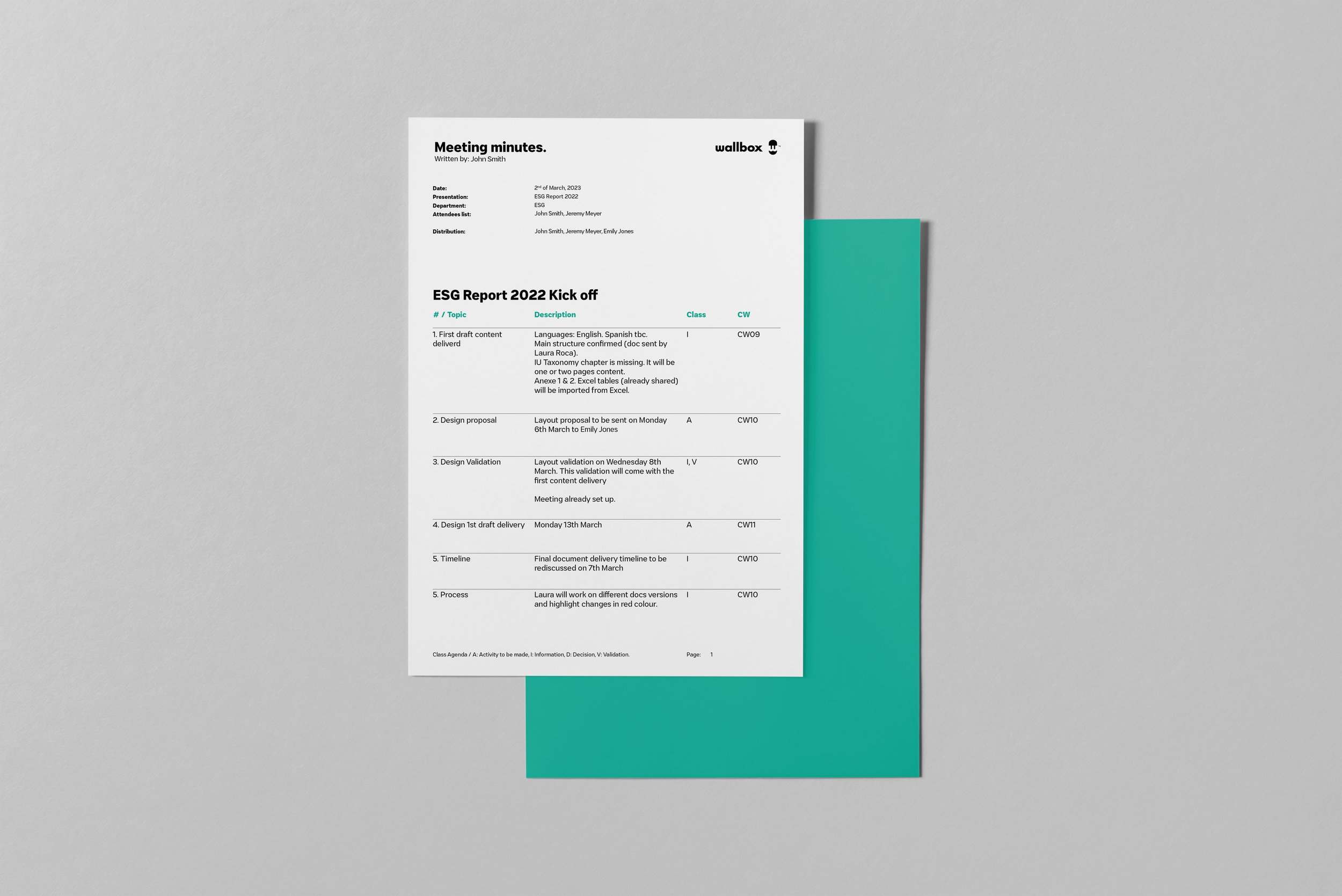
Meeting Minutes template
Word Sheet template
Report template -
[PDF] Online editable (short)
[PDF] Online editable (long)
[PDF] Printing Specifications
[Vector] Artwork Printing FIle
-
-
[PDF] Corporate Folder
[PDF] Notepad design
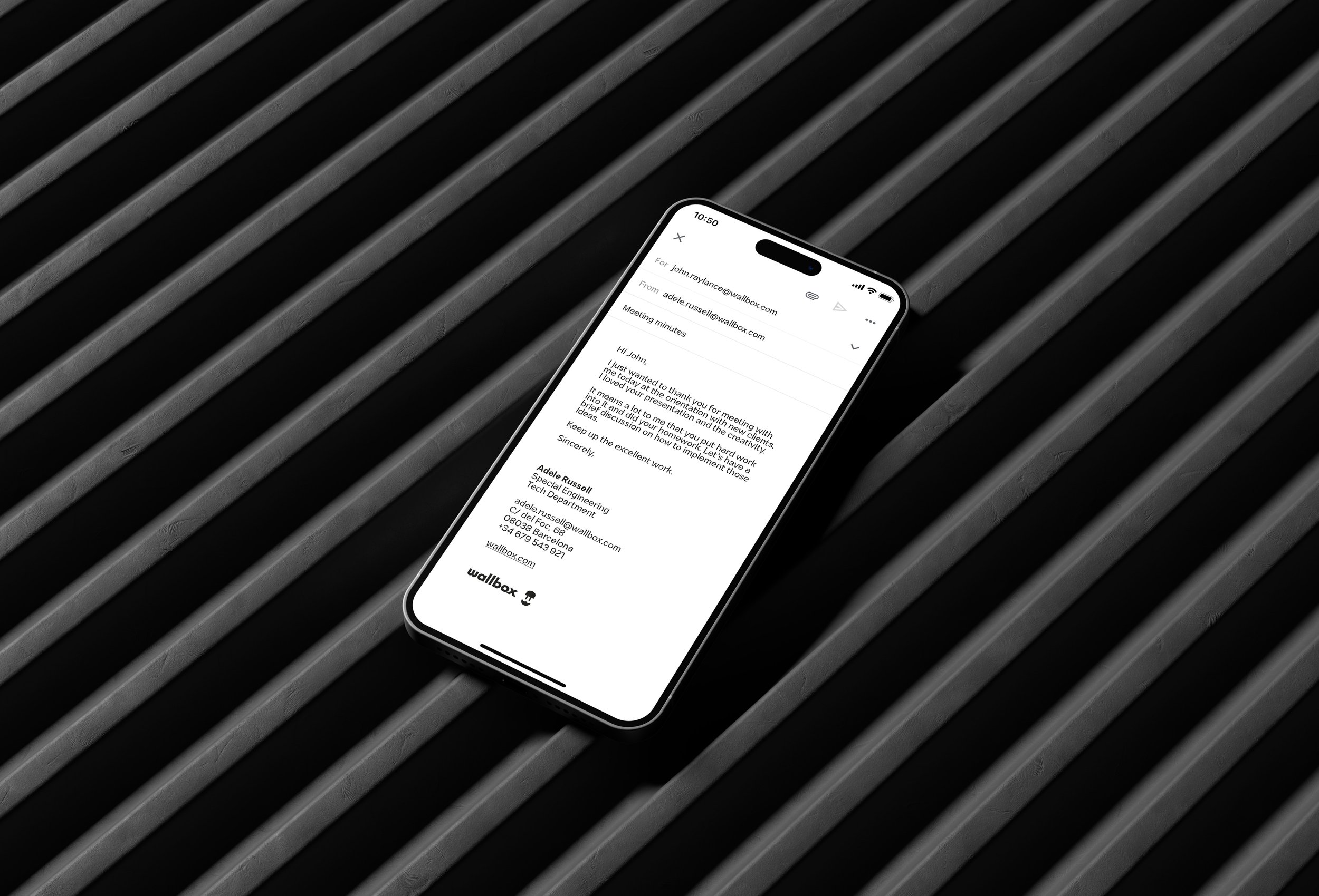
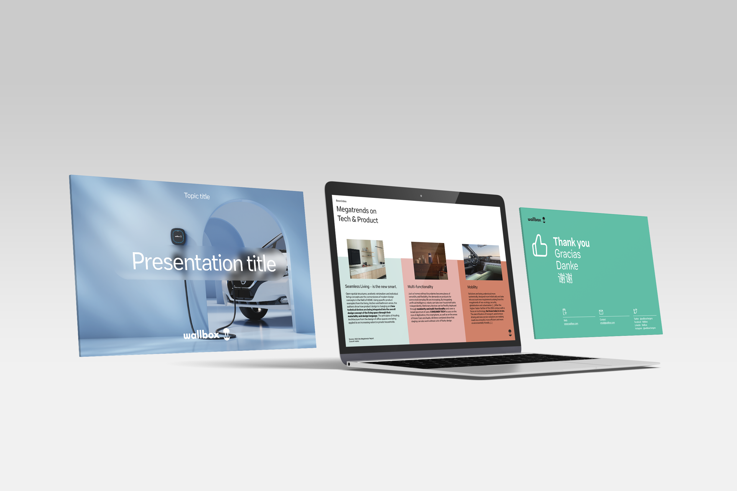
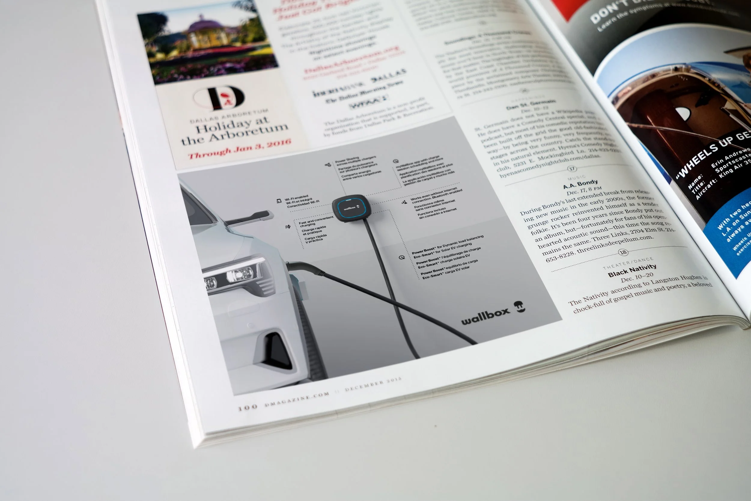
Download corporate literature templates for your daily basis.
Downloadables
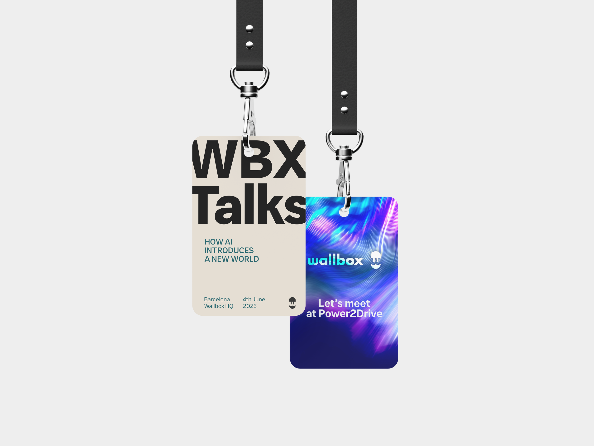
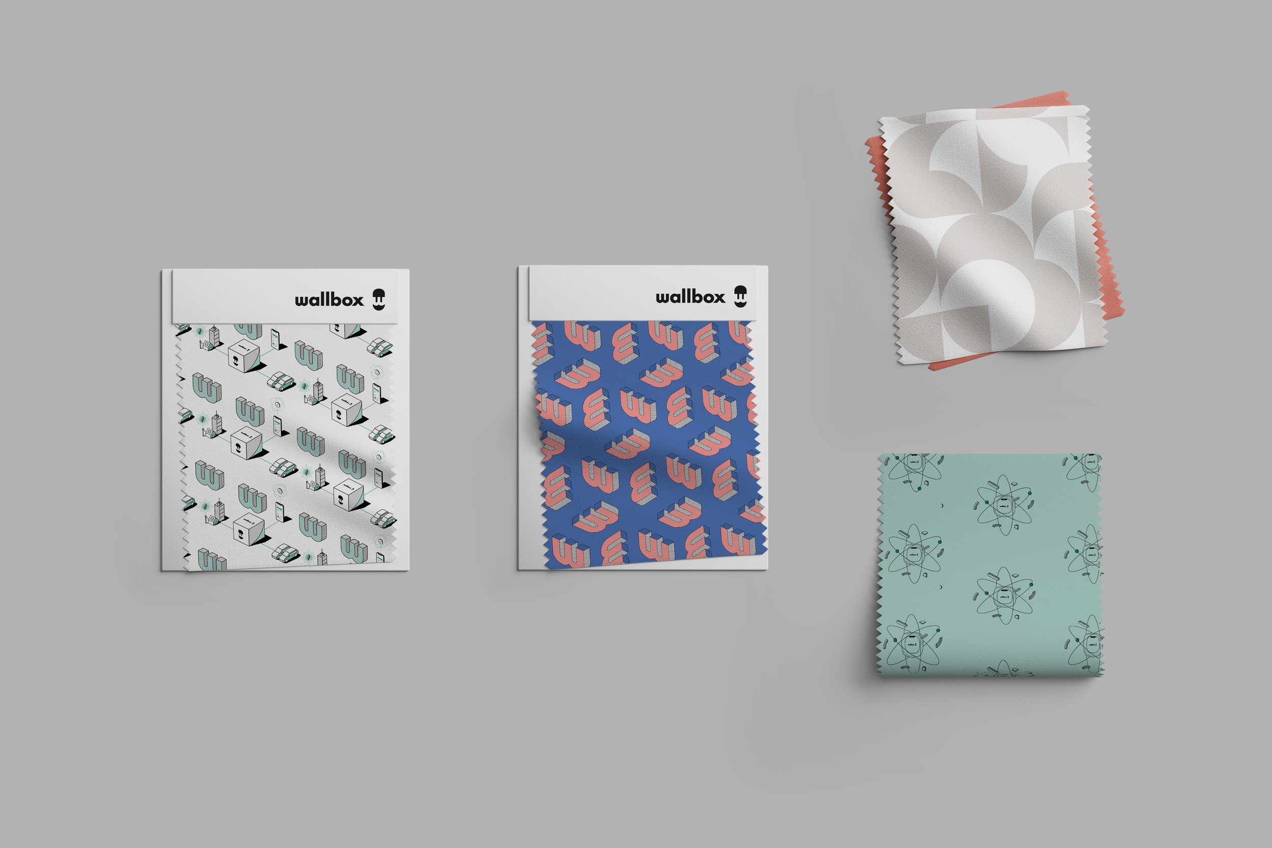
Brand Applications